Typography can make or break a brand faster than almost any other design decision. You can create a visually striking color palette, but if your headline font clashes with an illegible script subheader, potential customers will bounce from your sales page in seconds. For non-designers, choosing complementary typefaces feels like trying to decipher an ancient code of serifs, ligatures, and x-heights.
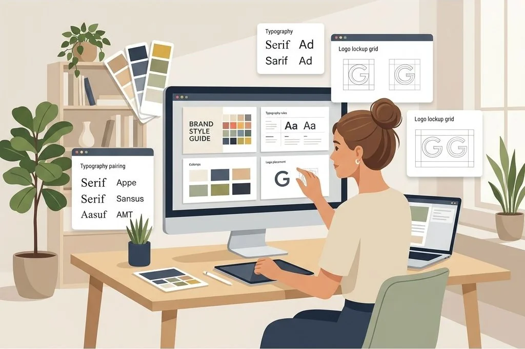
This widespread creative anxiety makes typographic guide sheets one of the most profitable digital products you can offer. By developing intuitive commercial typography font pairing templates in Canva, you provide entrepreneurs with pre-tested font combinations, visual scales, and commercial licensing guidelines that guarantee professional presentation across every marketing channel.
Key Takeaways
Here are the fundamental typographic principles that turn basic font lists into high-value commercial guides:
- Pair high-character header fonts with neutral, high-legibility body typefaces to establish immediate visual hierarchy.
- Rely exclusively on open-source, commercially licensed free fonts to prevent customer copyright complications.
- Provide exact mathematical size scales and line spacing ratios for mobile screens, desktop monitors, and printed documents.
- Include practical paragraph mockup examples displaying how headings, subheadings, quotes, and buttons interact visually.
- Connect typography cheat sheets with full brand identity bundles, utilizing the digital product formats I detail on PLR Biz Hub for online creators.
To skip the design phase and start selling profitable brand identity assets immediately, Ready-to-Sell Canva Branding Templates on plrbizhub.com provide professionally formatted digital kits that eliminate design fatigue while maximizing profit margins. These tested layouts allow creators to launch their digital stores in hours rather than weeks.
The Four Proven Font Pairing Formulas
When beginners try to pair fonts, they often pick two expressive typefaces that fight for attention. If both your headline and your subheadline shout with heavy personalities, reading fatigue sets in immediately. Successful typography relies on deliberate contrast and balance.
Inside my typography templates, I organize pairing recommendations around four time-tested formulas:
- Editorial Elegance (Modern Serif + Clean Geometric Sans): Pairing a sophisticated high-contrast serif like Playfair Display or Bodoni with a minimal sans-serif like Montserrat or Spartan. This combination works exceptionally well for luxury boutiques, interior designers, and lifestyle publications.
- Warm Approachability (Rounded Sans + Humanist Sans): Combining friendly, rounded header fonts like Quicksand with approachable body typefaces like Nunito or Open Sans. This formula fits wellness coaches, family brands, and children educators.
- Modern Authority (Bold Neo-Grotesque + Neutral Monospace): Pairing an assertive, heavy sans-serif like Anton or Archivo Black with a clean technical mono accent font like DM Mono. This structure commands attention in digital marketing, tech startups, and productivity apps.
- Artisanal Craft (Refined Monoline Script + Minimal Sans): Combining a delicate, highly legible monoline script header with an understated geometric sans like Poppins. This setup shines in handmade artisan shops, photography studios, and wedding planners.
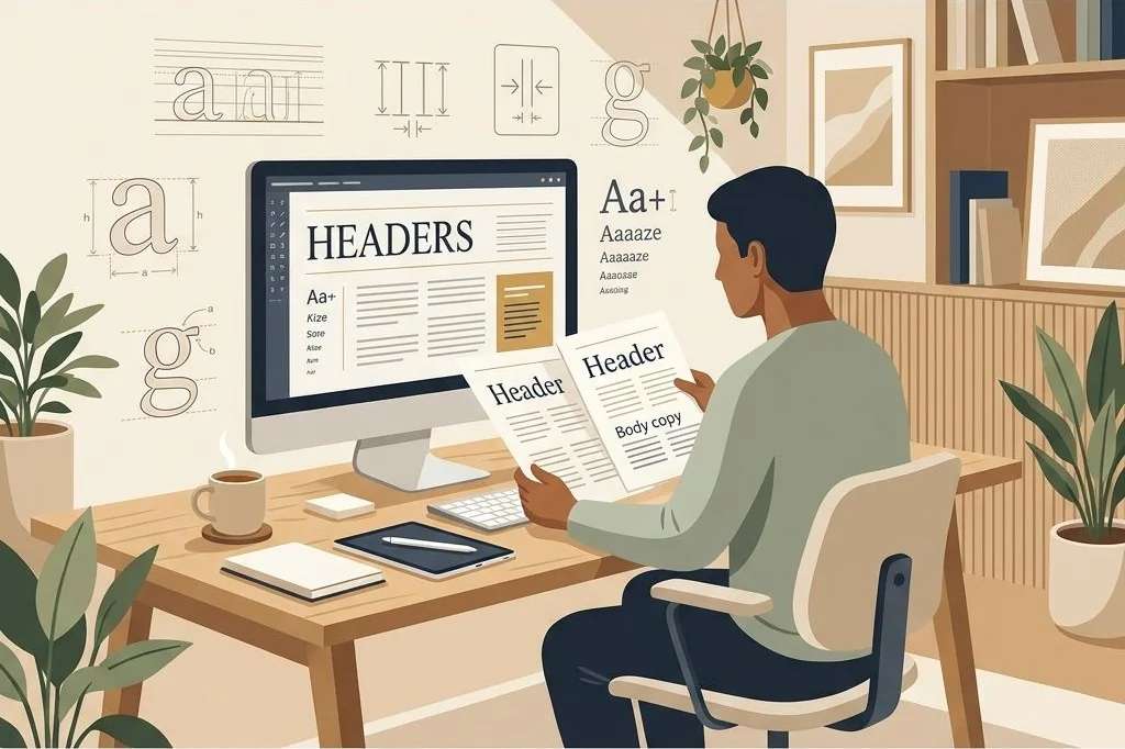
Presenting these formulas with visual specimen sheets allows clients to match their brand tone in seconds without second-guessing their design choices. I also demonstrate how to use font weights strategically within a single typeface family. Showing how a bold weight functions for headers while a regular weight supports body paragraphs teaches clients that visual diversity does not require loading ten different fonts into their design dashboard.
Establishing Mathematical Typographic Proportions
Great typography is fundamentally mathematical. If you randomly select font sizes without a scaling logic, pages look clumsy and disorienting. Professional designers use modular typographic scales based on classic ratios like the Golden Ratio (1.618) or the Major Third (1.25).
In my template layouts, I pre-configure modular scales so every heading and paragraph size relates mathematically. For example, using a Major Third ratio:
- H1 Hero Title: 39 pixels, tracking -0.02em, line height 1.15
- H2 Section Heading: 31 pixels, tracking -0.01em, line height 1.25
- H3 Subsection Title: 25 pixels, tracking 0em, line height 1.3
- Body Text: 16 pixels, tracking 0.01em, line height 1.5
- Caption / Small Tag: 13 pixels, tracking 0.03em, line height 1.4
Documenting these exact numbers directly on the template canvas gives buyers an infallible reference sheet. To discover how proportional scaling guarantees clarity across multi-page layouts, review my guide on creating balanced daily and weekly layout grids.
Commercial Licensing and Font Safety in Canva
One of the most dangerous traps for template creators is using desktop fonts that require expensive third-party commercial desktop licenses. If a customer buys your template and discovers that using the font for their client work requires a three-hundred-dollar foundry license, your customer relationship is ruined.
To ensure total legal safety, build your templates exclusively with typefaces that belong to the open-source Google Fonts library available natively on Canva free accounts. Fonts like Inter, Playfair Display, Poppins, Merriweather, and Cormorant Garamond come with permissive Open Font Licenses (OFL), allowing buyers to use them freely for commercial merchandise, client websites, and digital downloads without royalty fees.
If you want to offer clients pre-tested commercial branding kits that include licensed graphics, fonts, and social media post layouts ready for resale, examine the PLR Social Media Branding Templates Kit as a comprehensive starting point. Combining typography templates with social media post bundles dramatically increases customer perceived value.
I also include a dedicated licensing disclosure page inside my template deliverables. Summarizing font usage rights, web embedding guidelines, and desktop installation steps gives business buyers complete legal peace of mind.
Formatting Visual Hierarchy in Slide and Document Kits
Typography does not live in an isolated bubble; it functions as the structural skeleton of presentation decks, lead magnets, and client proposals. Buyers love templates that show how their typography looks when applied to complex multi-element pages.
I dedicate several pages in my Canva guides to complete mockups: a title slide, a bulleted list page, an image-and-quote card, and a pricing table. Demonstrating how the primary serif looks over photography and how the sans-serif body text maintains crisp legibility on small phone screens removes guesswork. For deeper insights on structuring visual flow across slides, read my article on visual hierarchy and typography in masterclass slides.
When you present typography in context rather than as an abstract list, customers recognize the immense time-saving value of your product. They can hand the guide to an assistant or contractor with total confidence that their brand voice remains consistent across every marketing asset.
Frequently Asked Questions
Can I legally sell Canva templates that use Google Fonts?
Yes, Google Fonts are distributed under open-source licenses that permit both personal and commercial use in editable templates, digital products, and print materials without paying licensing fees.
How many font families should a commercial brand guide recommend?
A professional brand guidelines document should recommend a maximum of two or three font families: a primary display font for headlines, a highly legible body font for paragraphs, and an optional accent font for quotes.
What is the ideal line height ratio for body paragraphs in digital documents?
For body copy on digital screens, a line height ratio between 1.4 and 1.6 (or 140% to 160% of the font size) provides optimal reading comfort and prevents lines of text from crowding together.
How do I share font pairing templates without forcing buyers to install fonts?
By selecting typefaces already integrated into Canva’s native font library, buyers can edit and customize the templates immediately inside their browser without downloading external font files to their computers.