Few things create more client confusion than handing over a random list of hexadecimal numbers in an email. A client looks at a string of six letters and numbers and has zero idea how to apply those shades to their website, social media graphics, or packaging. Without visual hierarchy and context, even the most beautiful color scheme falls apart the moment a client tries to design a promotional banner.
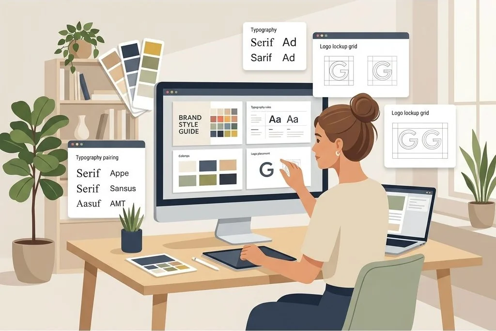
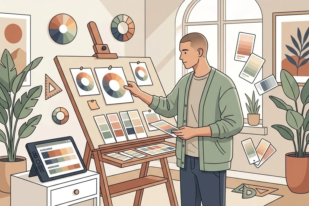
To eliminate this friction, professional designers rely on structured presentation boards. Designing clear, intuitive color palette board templates for clients allows you to showcase primary hues, supporting neutrals, and contrast accent colors in a balanced visual format that anyone can understand and implement immediately.
Key Takeaways
Here are the essential design mechanics that turn basic color swatches into actionable branding boards:
- Structure palette boards around the 60-30-10 distribution rule to guide clients on dominant, secondary, and accent color usage.
- Display complete color breakdowns including Hex codes for web, RGB for screens, and CMYK values for physical print production.
- Incorporate high-contrast background test blocks to verify readability and accessibility compliance across dark and light modes.
- Provide editable mockup sections where clients can see their colors applied to sample buttons, cards, and social posts.
- Combine color boards with editable marketing collateral, following the template production systems I document on PLR Biz Hub for digital product sellers.
To skip the design phase and start selling profitable brand identity assets immediately, Ready-to-Sell Canva Branding Templates on plrbizhub.com provide professionally formatted digital kits that eliminate design fatigue while maximizing profit margins. These tested layouts allow creators to launch their digital stores in hours rather than weeks.
The 60-30-10 Rule in Color Board Architecture
The most common mistake amateur designers make when delivering color palettes is presenting five equally sized color circles on a page. When every color receives equal visual weight, clients assume they should use all five colors in equal proportions across their marketing materials. The predictable result is a chaotic visual circus.
In my palette board templates, I use asymmetrical layout containers that visually reinforce the interior design 60-30-10 rule:
- Sixty Percent Dominant Canvas: A massive rectangular swatch block representing the foundational background tone, typically a warm neutral, soft cream, or clean slate gray.
- Thirty Percent Secondary Structure: Medium-sized cards showing secondary brand colors used for text blocks, navigation bars, structural dividers, and card borders.
- Ten Percent High-Contrast Accent: Small, high-visibility circular or rounded badges showcasing the primary call-to-action button color, notification tags, and highlight elements.
When clients view their palette structured this way, they instinctively understand how to balance their marketing collateral without needing hours of design coaching.
I also include guidance on color psychology right next to the swatches. Adding brief notes explaining that warm terracotta evokes grounded reliability while sage green communicates renewal helps clients defend their branding choices when presenting to business partners or investors.
Technical Color Specifications That Prevent Production Disasters
A client might love how an electric blue shade looks on their glowing smartphone screen, but when they send a business card order to a local print shop, that electric blue turns into a muddy purple mess. Color behaves completely differently across light-emitting RGB screens and physical CMYK ink processes.
Your color palette template must include organized data callouts beneath every single swatch card. For every primary and secondary hue, I format clean text blocks displaying:
- Hexadecimal Code: The six-character web standard for CSS and digital platform styling.
- RGB Values: Red, green, and blue numerical coordinates for digital displays and video graphics.
- CMYK Ratios: Cyan, magenta, yellow, and black ink percentages for commercial print production.
- Pantone Matching System (PMS) Notes: Recommended spot color references for custom merchandise and packaging runs.
Providing these exact technical coordinates saves your clients from costly printing mistakes and cements your reputation as an experienced branding specialist. When clients hand these formatted color specifications to web developers or apparel manufacturers, there is zero ambiguity about exact color expectations. Adding a short note explaining how to copy hex codes into website builders like WordPress or Shopify further enhances the practical value of your deliverable.
Integrating Real-World Component Previews
Abstract color chips look pleasant in isolation, but clients struggle to envision how those colors translate into tangible marketing assets. The highest-converting palette board templates bridge this gap by including miniature UI preview components directly on the presentation canvas.
I dedicate the lower half of my template boards to small mockups displaying a primary action button, a sample notification alert, and a clean social media card quote. Seeing dark text set against the proposed cream background and a bold coral button sitting above it provides immediate visual proof that the color system works harmoniously. If you need ready-made design assets that integrate seamlessly with client branding kits, look at the PLR Social Media Branding Templates Kit for pre-tested visual layouts.
Building these practical components directly inside versatile cloud software like Canva ensures that buyers can duplicate the board, update the global brand colors with two clicks, and export high-resolution client deliverables in minutes. For complementary layout strategies across presentation formats, review my tutorial on choosing the best presentation formats for template sales.
Accessibility and Contrast Testing Guidance
Modern branding requires strict adherence to digital accessibility standards. If a business uses light yellow text on a white button, visually impaired visitors cannot read the call to action, leading to lost sales and potential compliance issues.
Inside each palette template, I include a dedicated contrast validation chart. This simple matrix pairs every proposed background tone with the approved foreground text colors, indicating whether the combination passes Web Content Accessibility Guidelines (WCAG) AA standards with a minimum 4.5:1 contrast ratio.
Educating clients on contrast safety directly within the template prevents them from making poor legibility choices. It demonstrates that your templates are not just decorative art projects, but functional, commercial tools engineered for real business growth. To discover how clean structural grids maintain usability across different media types, read my guide on Canva document creation workflows.
I also provide seasonal adaptation tips showing how clients can swap an accent tone during holidays or promotional sales without breaking brand recognition. Offering this long-term flexibility turns a simple color board into an indispensable branding asset.
Frequently Asked Questions
How many colors should a client color palette board include?
An ideal commercial color palette board includes five to seven colors: one dominant light neutral, one dark anchoring tone for typography, two primary brand hues, and one or two high-contrast accent colors for buttons and highlights.
Can I convert RGB colors to CMYK inside Canva?
While Canva designs natively in RGB, users on Canva Pro can export designs using the PDF Print option with the CMYK color profile selected, ensuring accurate color separation for commercial print presses.
What is the difference between a mood board and a color palette board?
A mood board captures the overall emotional vibe, texture, and visual inspiration through photographs and textures, whereas a color palette board delivers precise color codes, usage ratios, and technical reproduction values.
How do I test color contrast ratios for digital accessibility?
Use free online contrast checkers or Canva’s built-in accessibility tools to verify that text colors achieve at least a 4.5:1 contrast ratio against their underlying background colors.